Lecture 13: Color

Brian J. Smith

2026-03-24

Color

The beginning of this lecture is based on Chapter 10 of Visualization Analysis & Design.


“Map Color and Other Channels”


For this lecture, I’m going to start with some color theory from the VAD Text, incorporate a few other sources of information, then transition over to working with color in R.
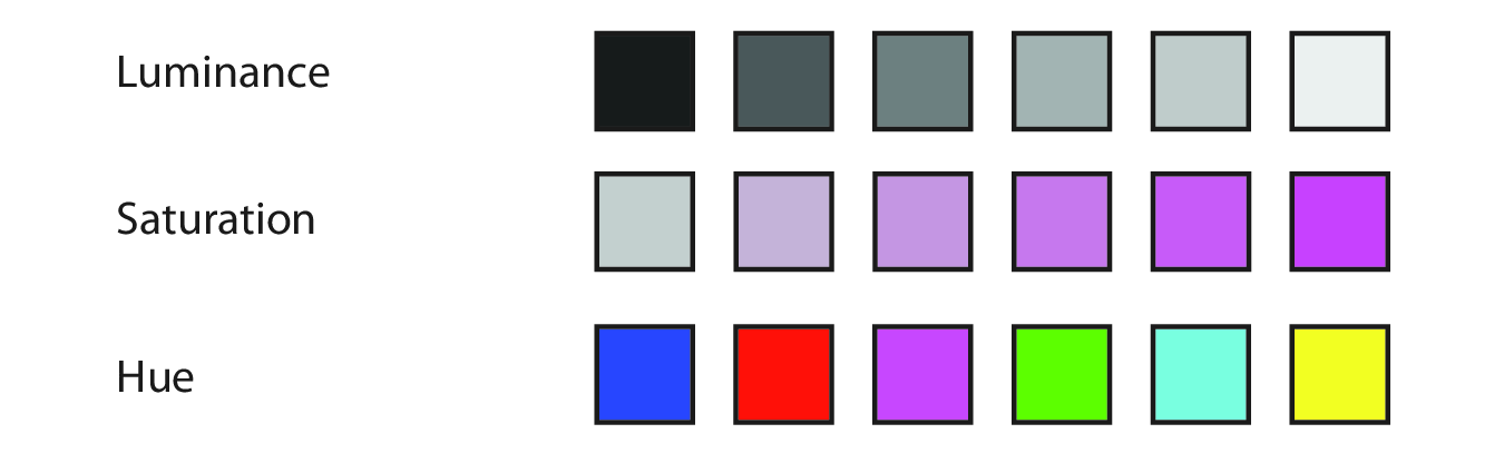
Visualization Analysis & Design Cover

Color Theory

Color Vision

  • Our eyes have two kinds of receptors:
    • Rods
      • Actively contribute to vision only in low-light settings.
      • Provide low-resolution black & white information.
    • Cones
      • Main sensors in normal lighting.
      • Three types of cones for different wavelengths.

Color Vision

  • Our visual system processes these signals into three opponent color channels:
    • One from red to green,
    • one from blue to yellow,
    • and one from black and white (luminance).
  • The luminance channel provides high-resolution edge detection.
    • Red-green and blue-yellow channels are lower resolution.
  • There is an important distinction between:
    • Luminance – how bright or dark a color is.
    • Chromaticity – what most people informally call “color”.

Color Vision

  • Color blindness, more accurately termed color deficiency, affects a person’s ability to distinguish color along one of the chormaticity channels.
  • There are three types of color deficiency:
    • Deuteranopia and protanopia
      • Affect red-green channel.
      • Are sex-linked (~ 8% of men).
    • Tritanopia
      • Affects blue-yellow channel.
      • Extremely rare, not sex-linked.

Color Spaces

  • The color space of what we can detect is three-dimensional.
    • It can be adequately described by three orthogonal axes.
    • There are many ways to define these axes and convert between them.
    • Some color spaces are:
      • convenient/commonly used (e.g., RGB)
      • designed to match our vision (e.g., HSL)

RGB

  • Red, green, blue.
  • Computationally convenient.
  • Not useful as separable channels; create an integral perception.
    • Additive color model.
    • Screens emit light.
  • Not covered in the VAD textbook.

RGB

  • Device-dependent color model.
    • Colors can vary slightly between devices,
    • or on a device over time.
  • TVs, cameras, scanners, video cameras, smartphones, etc.
  • See the Wikipedia RGB color model page.

RGB

  • Given as a triplet of red, green, blue values.
  • May range from 0 – 1.
  • More commonly range from 0 – 255.
  • Often coded using two hexadecimal digits (0-9, A-F).

CMYK

  • Subtractive color model.
    • Inks absorb light.
  • Cyan, magenta, yellow, black (= “key”).
  • Used in color printing.
  • Not even mentioned in the VAD textbook.
  • See the Wikipedia CMYK color model page.

HSL/HSV

  • HSL = Hue, saturation, lightness.
  • HSV = Hue, saturation, grayscale value.
    • V is linearly related to L.
  • More intuitive and heavily used by artists and designers.

HSL

  • Hue captures what we normally think of as “pure” colors.
    • E.g., red, blue, green, yellow, purple, etc.
    • Not white or black.
  • Saturation captures the amount of white mixed with the color.
    • E.g., pink is desaturated red (more white mixed in).
  • Lightness captures the amount of black mixed with the color.
    • E.g., controlling the darkness of a gray.

HSL

  • HSL is pseudoperceptual.
    • It doesn’t truly reflect how we perceive color.

“In particular, lightness L is wildly different from how we perceive luminance.”

HSL

Fig. 10.3

Fig. 10.3
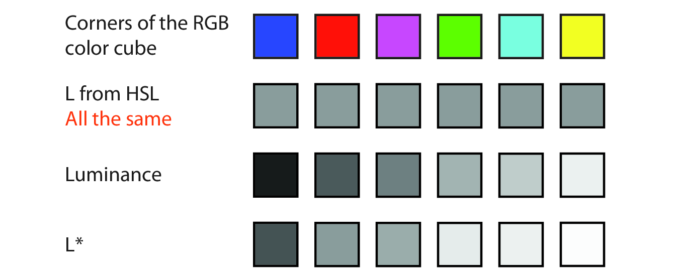
  • Lightness is all the same here.
  • True luminance is as measured with an instrument.
  • L* is perceptually linear, the closest to what we see.

HSL

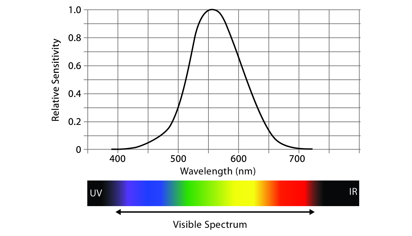
  • Our perception of luminance depends on the wavelength of the light.
  • Our spectral sensitivity curve for daylight vision is almost bell-shaped.

Fig. 10.4

Fig. 10.4

HCL

  • Hue, chroma, luminance.
  • Used to address perceptual issues with saturation.
  • Chroma = “colorfulness”.
  • Not mentioned in the VAD textbook, but seems increasingly popular in the visualization world.

Choosing Color Channels

Choosing Color Channels

  • Magnitude channels (ordered):
    • Luminance
    • Saturation
  • Identity channels (categorical):
    • Hue
  • Other channels (complementing the others):
    • Transparency

Choosing Color Channels

  • We automatically perceive luminance and saturation as ordered.
  • We do not automatically perceive hue as ordered.
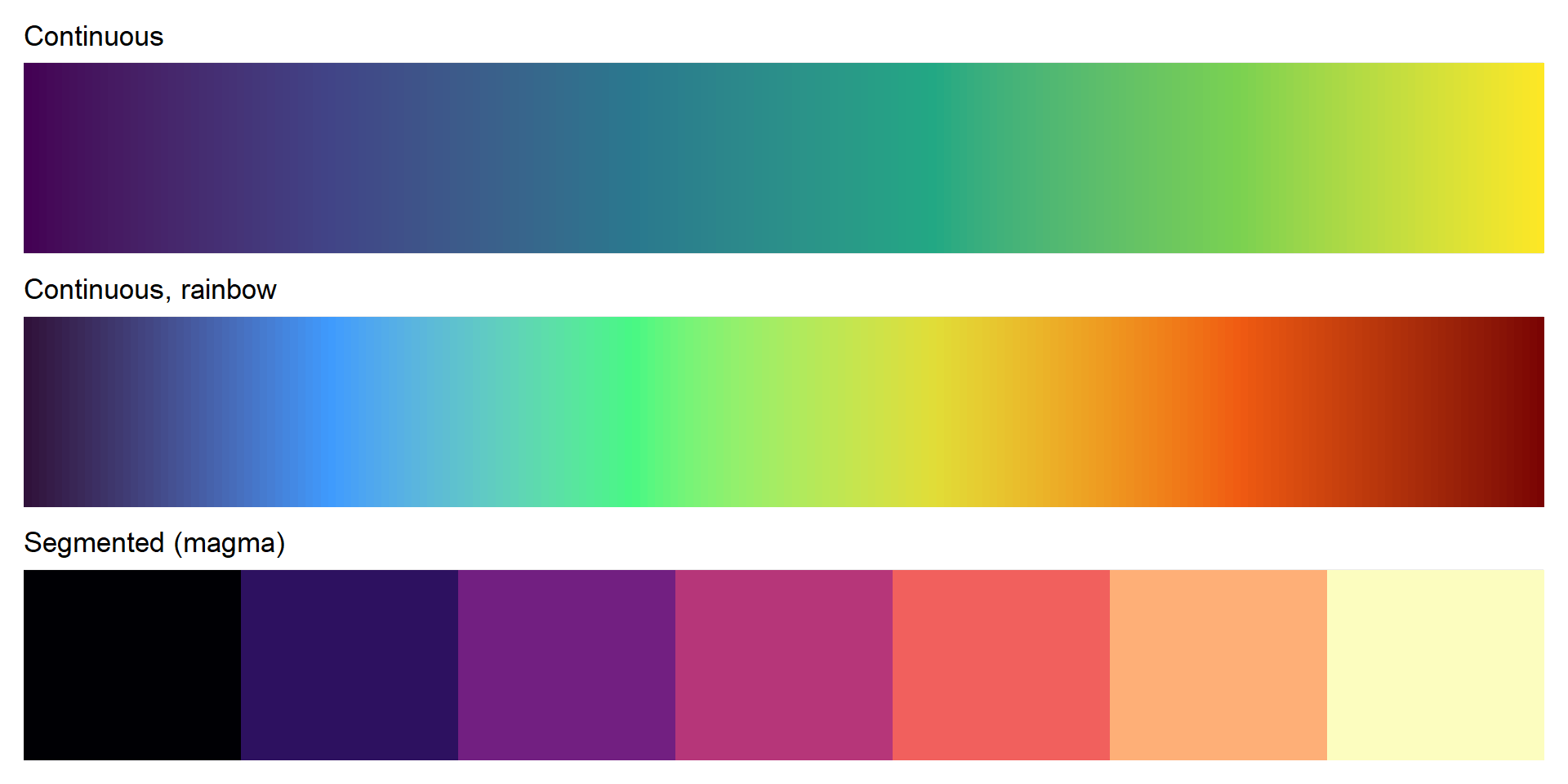
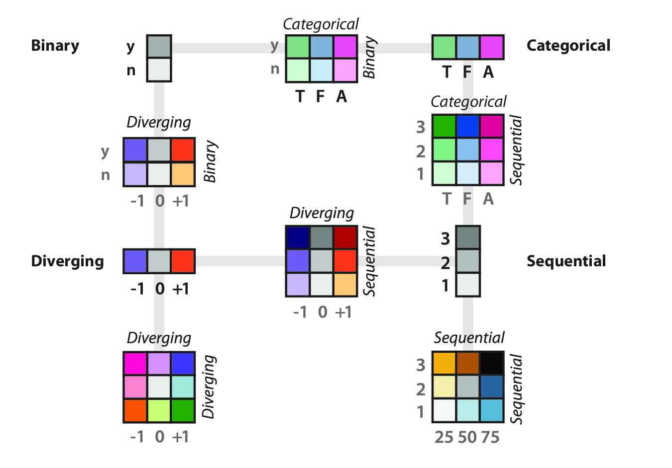
Fig. 10.5

Fig. 10.5

Magnitude Channels

  • Luminance is suitable for ordered data.
  • We have low accuracy in perceiving luminance of noncontiguous regions.
    • Due to contrast effects.
  • Number of discriminable bins is probably < 5 if the background is not uniform.
  • Luminance contrast is very important for resolving fine details.
    • E.g., we can’t read text without luminance contrast.
    • Hue and saturation are not important for this.
    • If we use the luminance channel for our data, we may not have it to use for other reasons.

Magnitude Channels

  • Saturation is also suitable for ordered data.
  • Also has the low accuracy problem for noncontiguous regions.
  • Number of discernable steps is around 3.
  • Interacts strongly with size:
    • Small marks (e.g., points/lines) are harder to discern.
    • Probably only want to use two saturation bins for small marks.

Identity Channels

  • Hue is appropriate for categorical data.
  • Hue is the highest ranked channel for categorical data after spatial position.
  • Also hard to make small comparisons in noncontiguous regions.
  • Also harder to distinguish in smaller marks.

Other Channels

  • Transparency is a fourth available channel.
  • It interacts strongly with luminance and saturation and should not be used in conjunction with those two.
  • It can be used with hue for a small number of bins, often two.
  • Most often used with superimposed layers.
    • Create a foreground layer distinguishable from the background.
  • Frequently used redundantly.
    • Same information also in another channel.

Colormaps

Colormaps

  • Colormaps specify the mapping between colors and data values.
    • AKA, pseudocoloring or color ramps.
  • Mostly use a combination of hue, saturation, and luminance to encode data.
    • Rather than using the three independently as different channels.

Colormaps

  • Categorical
  • Ordered
    • Sequential
    • Diverging

Fig. 10.6

Fig. 10.6

Colormaps

  • Colormaps can be continuous or segmented.
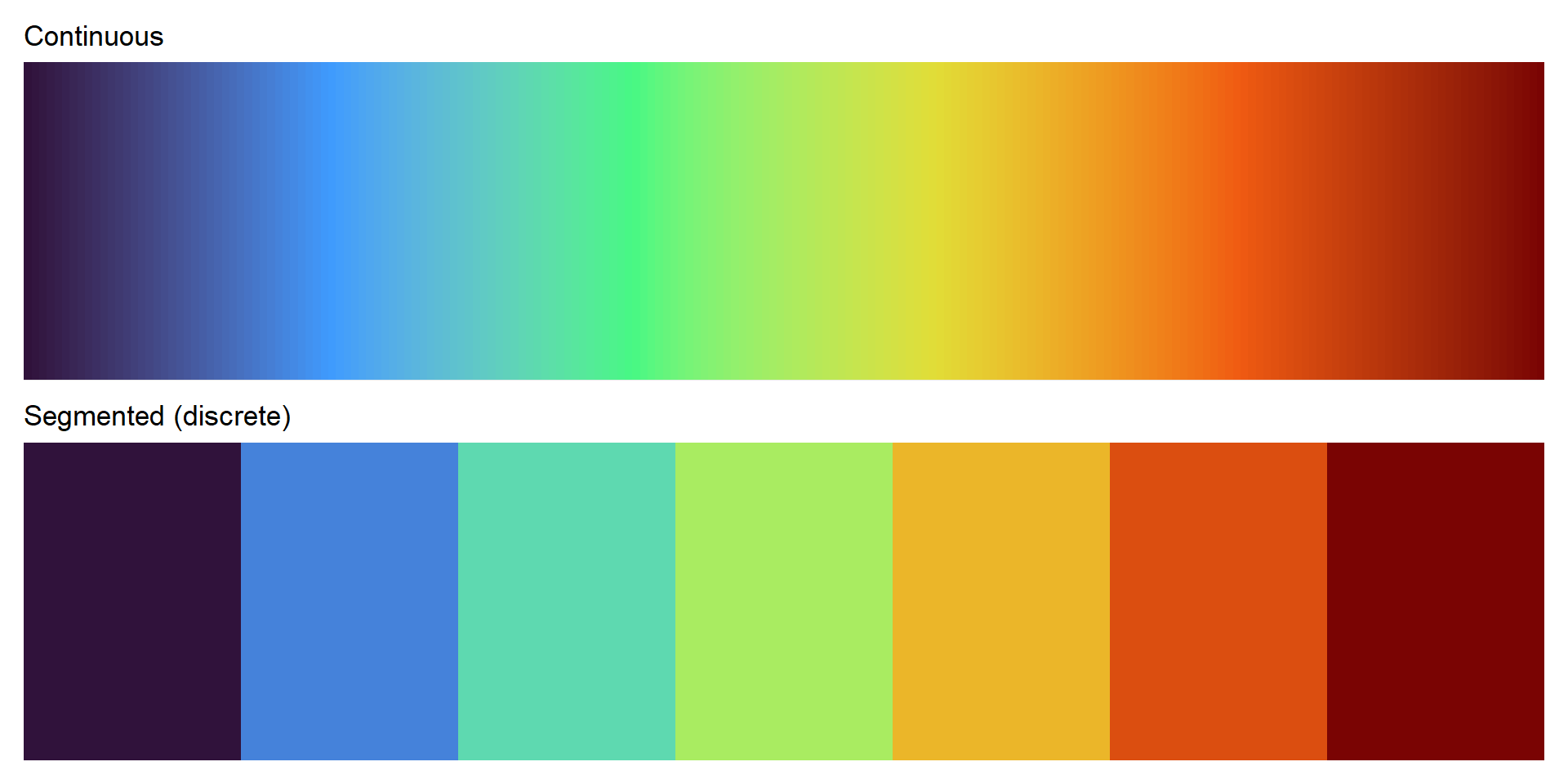
Colormaps

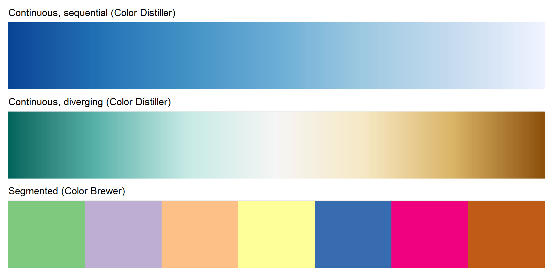
  • ColorBrewer is a good source for colormaps:
colorbrewer2.org.
  • Easily accessible in R with RColorBrewer.

Colormaps

  • viridis was created to have perceptual advantages.
  • It was created for R and has since been ported to other places.
  • Check out the viridis website.
  • The viridis vignette is a good source of information about the various colormaps.

Other Useful R Packages

Questions?


BCB5200 Home