Lecture 10: Arranging Tables
2026-02-24
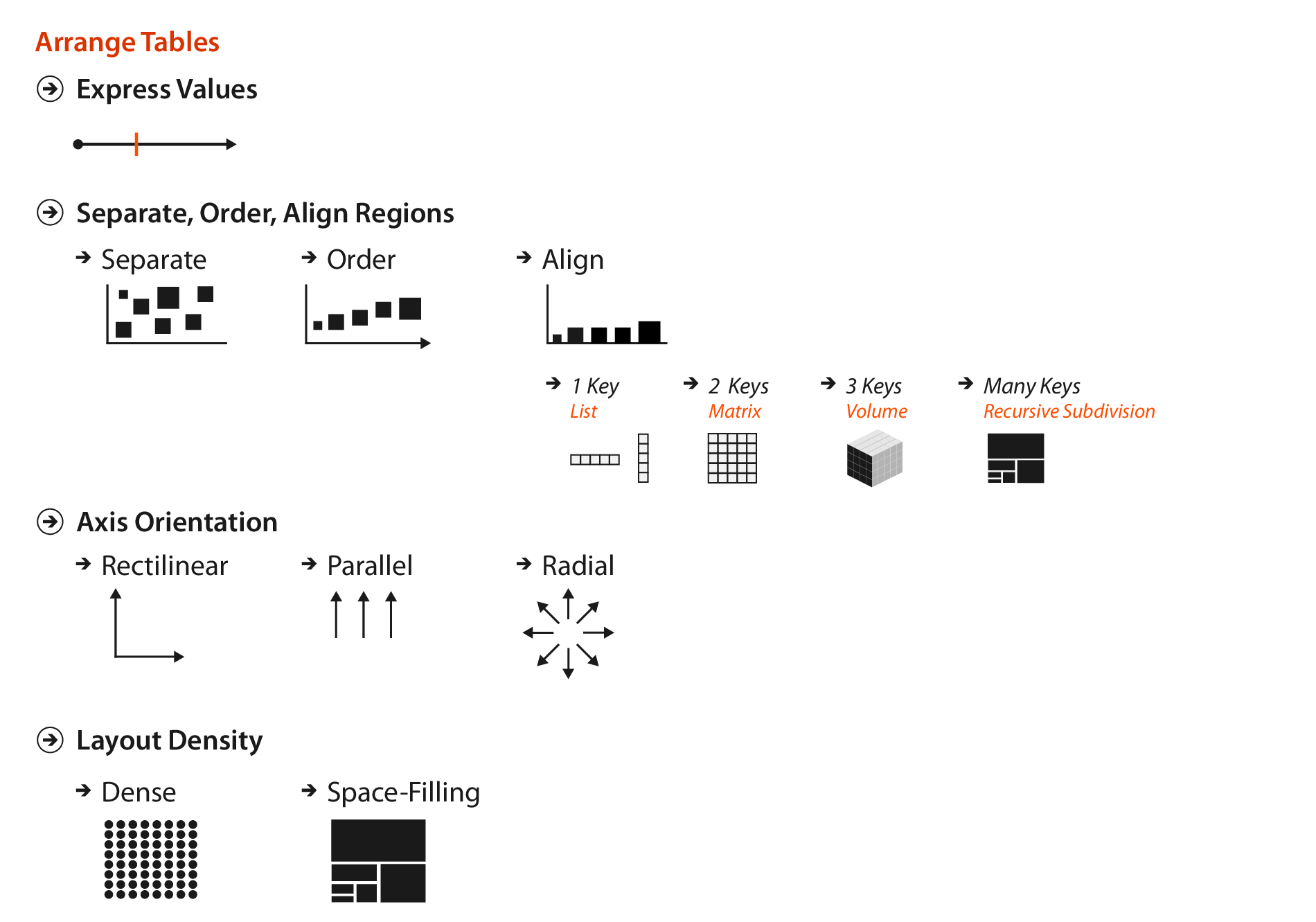
Arranging Tables
This lecture is based on Chapter 7 of Visualization Analysis & Design.
“Arrange Tables”
Arranging Tables
The goal of this chapter is to understand the visual encoding design choices for how to arrange tabular data spatially.
Express Quantitative Values
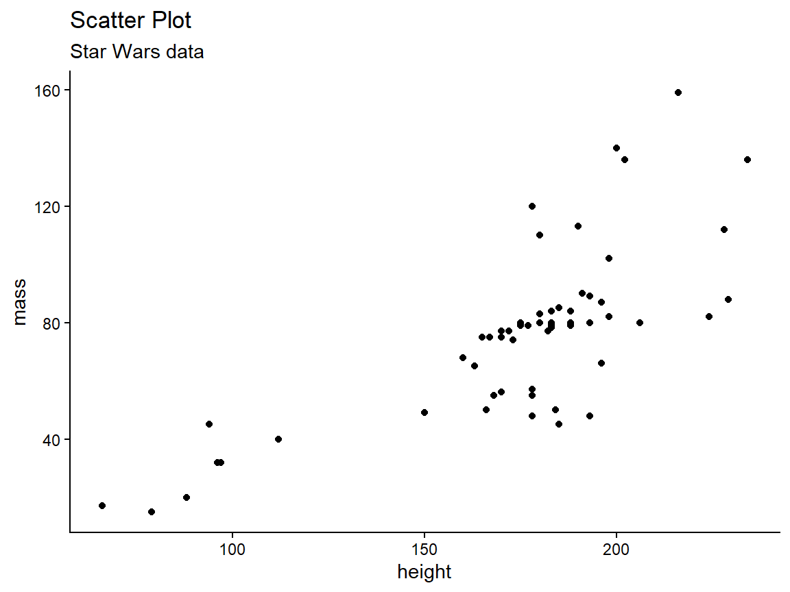
Scatter Plot
Two values, no keys
Separate, Order, Align
Bar Chart
One key, one value
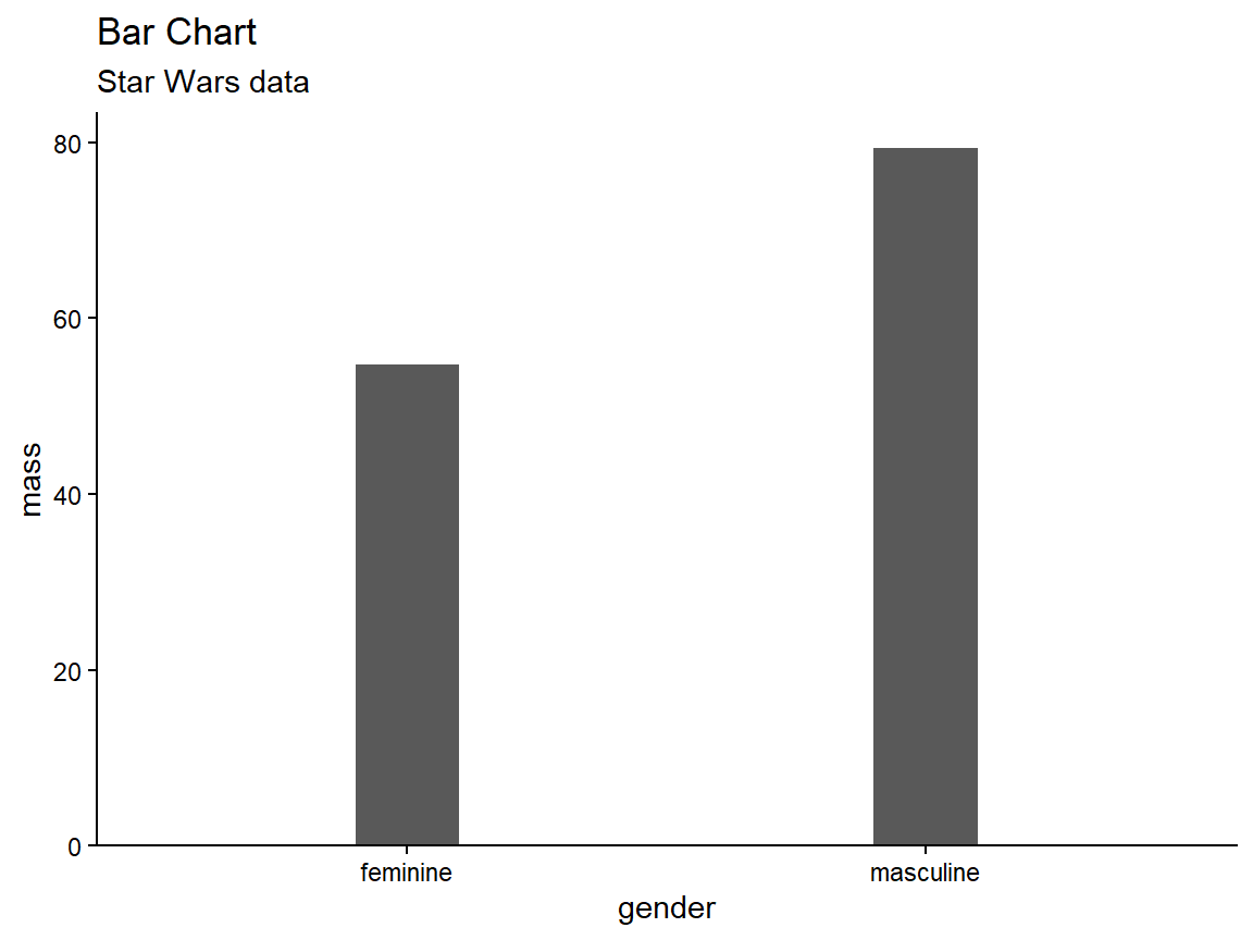
Separate, Order, Align
Bar Charts
- Use a line mark, aligned in a common frame.
- Encode a quantitative attribute with spatial position.
- Encode a categorical attribute with spatial region.
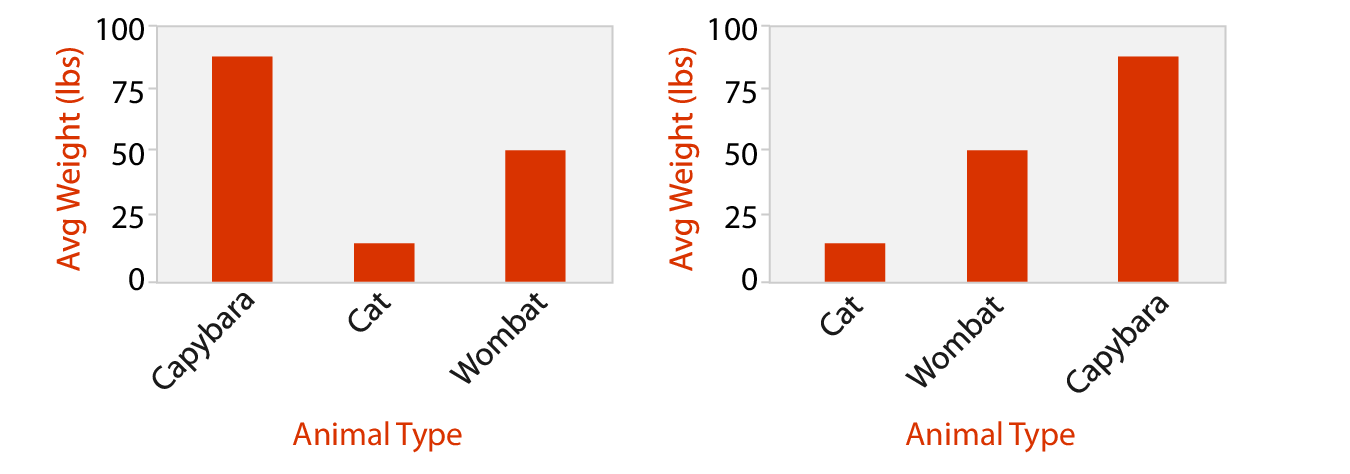
- Ordering can default to alphabetical or be data-driven.
Separate, Order, Align
Stacked Bar Charts
Code
starwars %>%
  filter(mass < 500,
         !is.na(gender),
         hair_color %in% c("black", "blond", "brown")) %>%
  mutate(gender = factor(gender),
         hair_color = factor(hair_color)) %>%
  group_by(gender, hair_color) %>%
  summarize(mass = sum(mass)) %>%
  ggplot(aes(x = gender, y = mass, fill = hair_color)) +
  geom_col() +
  xlab("Gender") +
  ylab("Total Mass") +
  scale_fill_discrete(name = "Hair Color") +
  coord_cartesian(expand = c(bottom = FALSE)) +
  ggtitle("Stacked Bar Chart", subtitle = "Star Wars data") +
  theme_bw()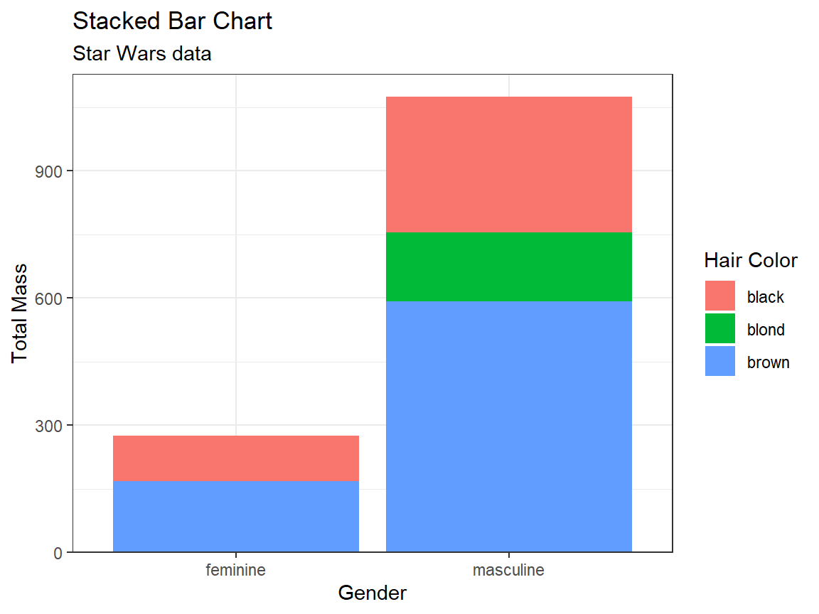
Separate, Order, Align
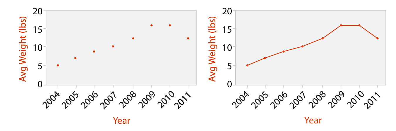
Dot and Line Charts
- Dot Chart
- Like a bar chart, but uses point marks (standard use); or, like a scatter plot, but one axis is ordered categories.
- One quantitative attribute using spatial position, one ordered attribute using spatial region.
- Line Chart
- A dot chart with lines connecting the dots to show trend.
Separate, Order, Align
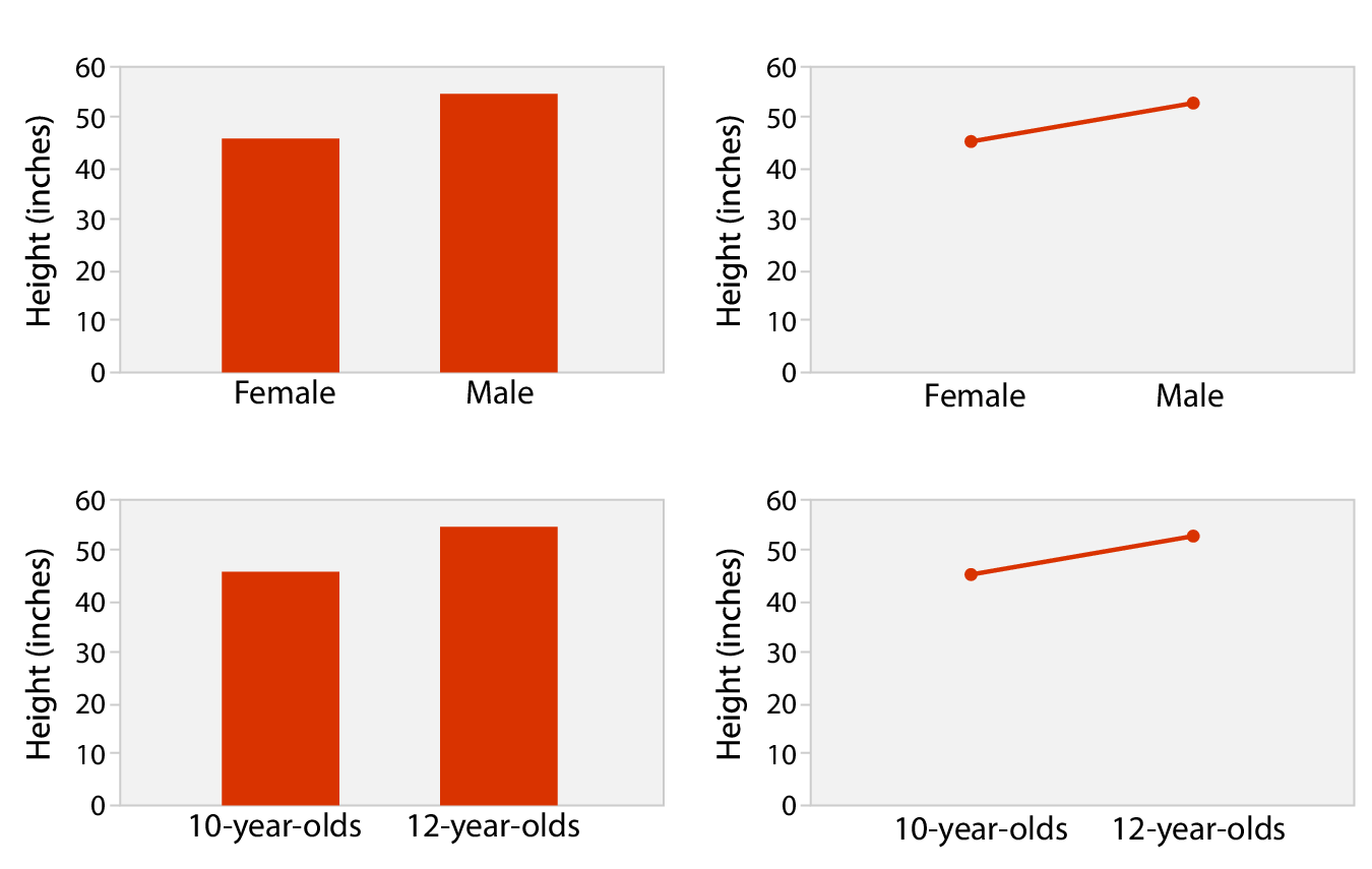
Bar vs. Line Charts
- Bar charts encourage discrete comparisons.
- Line charts encourage trend assessment.
- Should not be used for categorical (unordered) attributes (top right)
Separate, Order, Align
Heat Map
Two keys, one value
Code
hm <- starwars %>%
  filter(mass < 500,
         !is.na(gender),
         hair_color %in% c("black", "blond", "brown")) %>%
  mutate(gender = factor(gender),
         hair_color = factor(hair_color)) %>%
  group_by(gender, hair_color, .drop = FALSE) %>%
  summarize(n = n()) %>%
  ggplot(aes(x = gender, y = hair_color, fill = n)) +
  geom_tile() +
  coord_cartesian(expand = FALSE) +
  scale_fill_viridis_b() +
  ggtitle("Heat Map", subtitle = "Star Wars data") +
  theme_classic()

print(hm)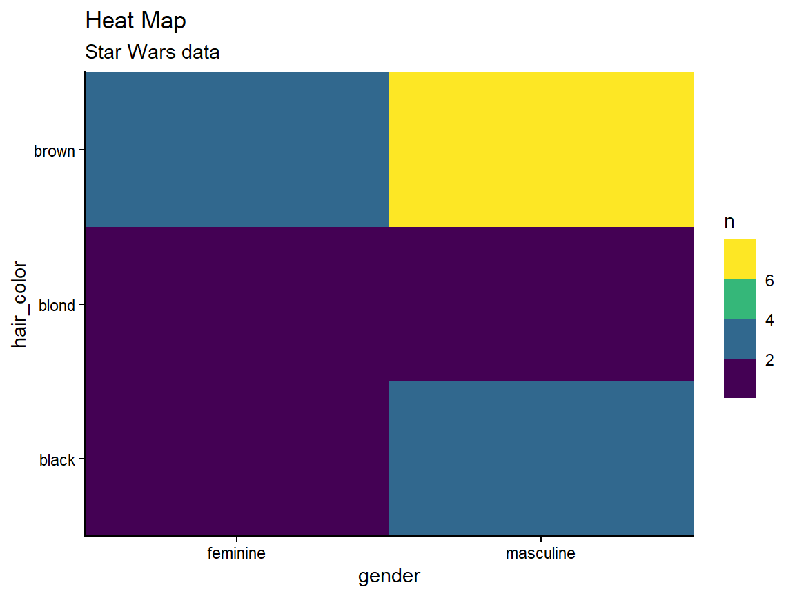
Separate, Order, Align
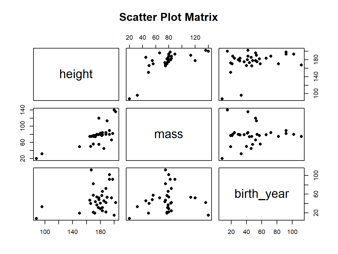
Scatter Plot Matrix
Many keys, many values
Separate, Order, Align
Faceted Scatter Plot
Many keys, many values
Code
starwars %>%
  filter(mass < 500,
         !is.na(gender),
         hair_color %in% c("black", "blond", "brown")) %>%
  mutate(gender = factor(gender),
         hair_color = factor(hair_color)) %>%
  ggplot(aes(x = height, y = mass)) +
  facet_grid(gender ~ hair_color) +
  geom_point() +
  coord_cartesian(expand = FALSE) +
  ggtitle("Faceted Scatter Plot", subtitle = "Star Wars data") +
  theme_bw()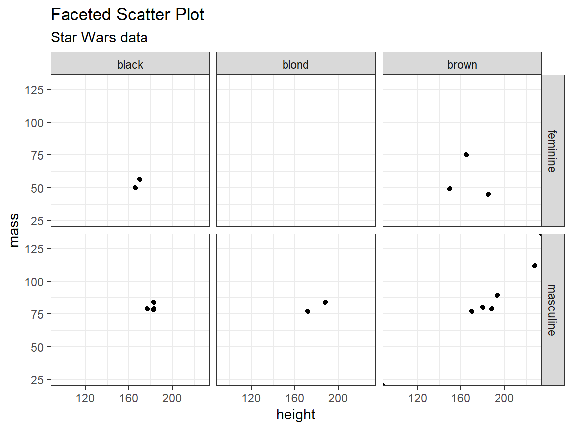
Spatial Axis Orientation
Parallel Layouts
- Allow more than three attributes to be encoded with spatial position channel.
- Parallel coordinates plots are used to show many attributes.
- Use jagged lines that cross each axis exactly once.
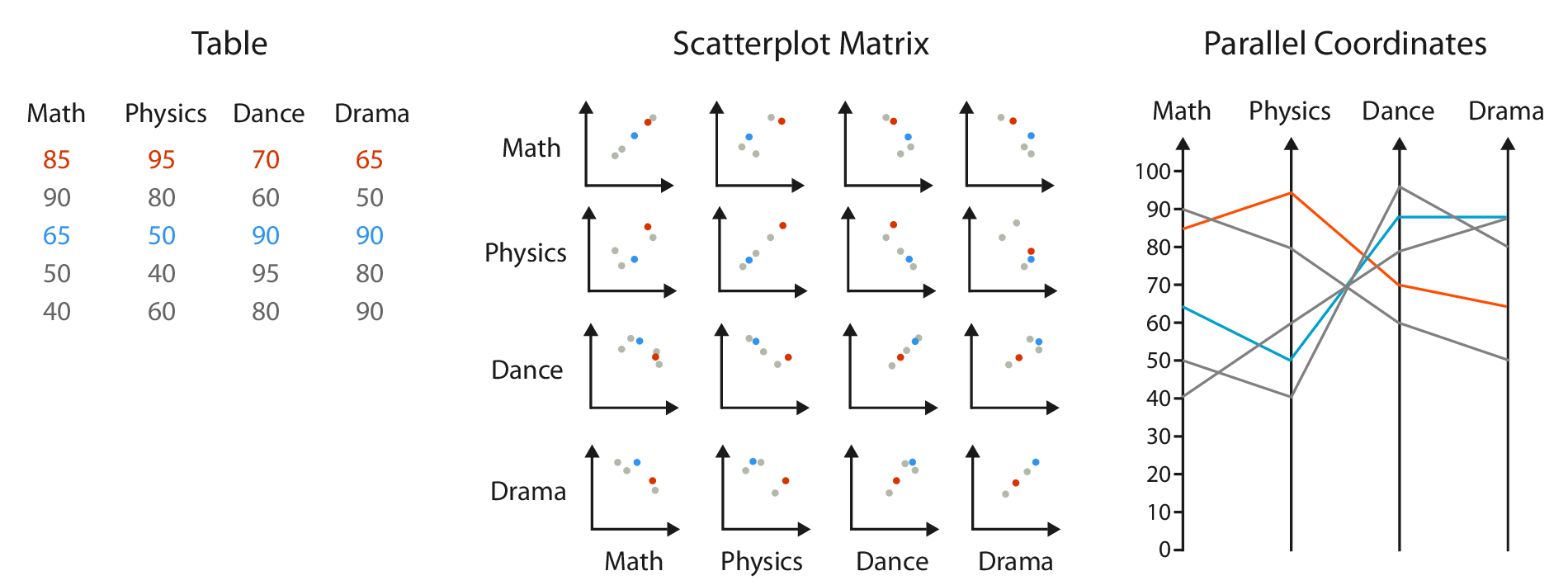
Spatial Axis Orientation
Parallel Layouts
- Use two spatial dimensions:
- one to show a quantitative value,
- the other to lay out the multiple axes.
Spatial Axis Orientation
Radial Layouts
- Items are distributed around a circle using the angle channel.
- Also uses one ore more linear spatial channels.
- Might imply one attribute is more important than another.
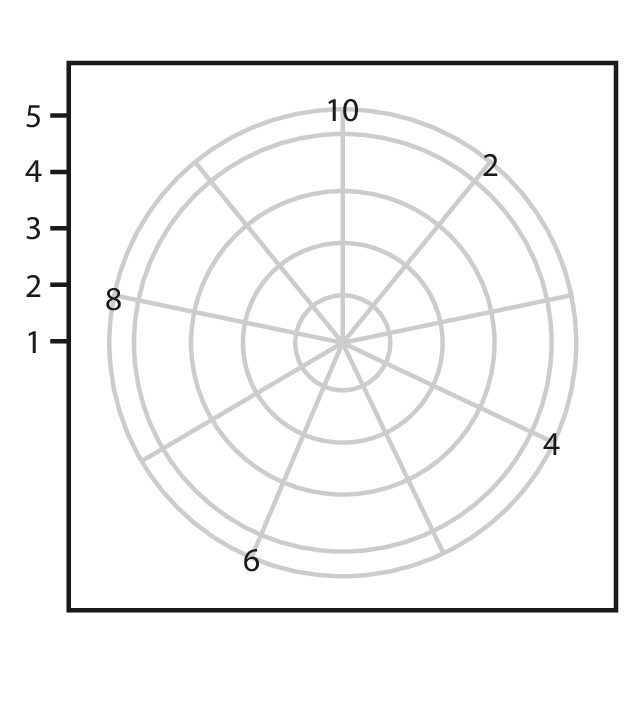
Spatial Axis Orientation
Radial Layouts
- Natural coordinate system is polar coordinates.
- One dimension is an angle.
- The other dimension is a spatial position.
- Mathematically completely equivalent to Cartesian coordinates.
Spatial Axis Orientation
Radial Layouts
Code
library(patchwork)

cyclic <- data.frame(x = seq(0, 2*pi, length.out = 300)) %>%
  mutate(y = sin(4*x))

a <- ggplot(cyclic, aes(x = x, y = y)) +
  geom_line() +
  ggtitle("Rectilinear") +
  theme_bw()

b <- a +
  coord_polar() +
  scale_x_continuous(breaks = c(0, pi/2, pi, 3*pi/2, 2*pi),
                     labels = c("0", "π/2", "π", "3π/2", "2π")) +
  ggtitle("Radial")

a + b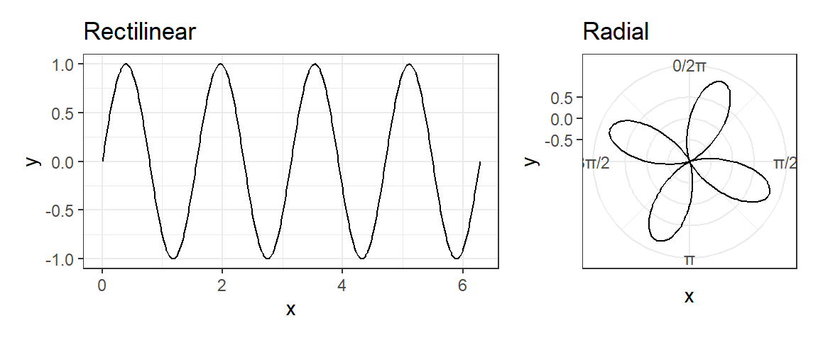
Side note, the polar transformation is a key idea behind the Fast Fourier Transform
Spatial Axis Orientation
Rectilinear vs. Radial Layouts

Spatial Axis Orientation
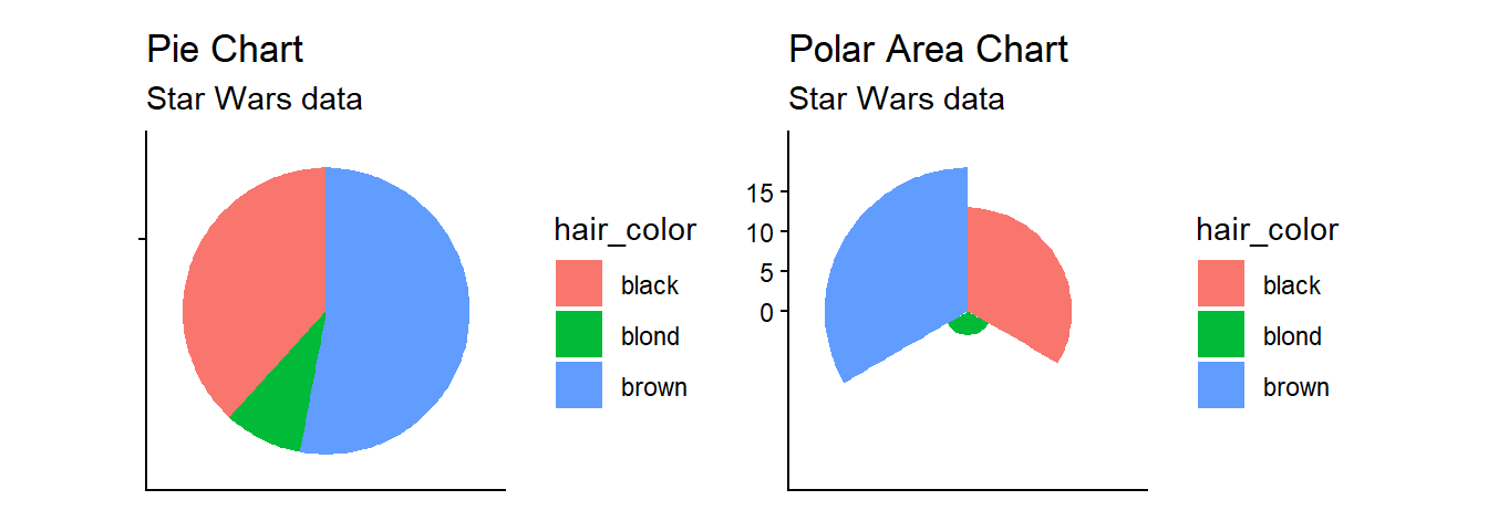
Pie Charts
Code
pie <- starwars %>%
  filter(hair_color  %in% c("black", "blond", "brown")) %>%
  group_by(hair_color) %>%
  summarize(n = n()) %>%
  ggplot(aes(x = "", y = n, fill = hair_color)) +
  geom_bar(stat = "identity", width = 1) +
  coord_polar("y", start = 0) +
  xlab(NULL) +
  ylab(NULL) +
  ggtitle("Pie Chart", subtitle = "Star Wars data") +
  theme_classic() +
  theme(axis.text.x = element_blank())
print(pie)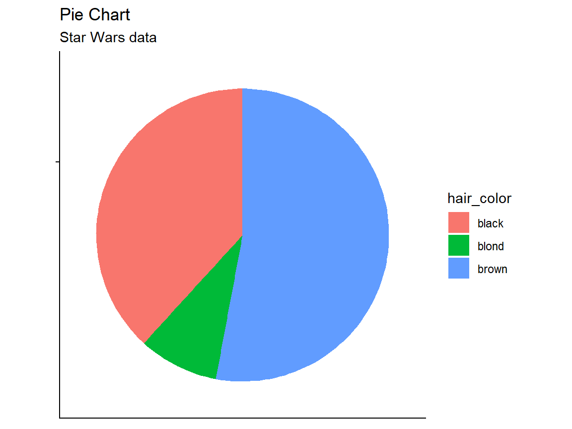
Spatial Axis Orientation
Polar Area Charts
Code
pa <- starwars %>%
  filter(hair_color  %in% c("black", "blond", "brown")) %>%
  group_by(hair_color) %>%
  summarize(n = n()) %>%
  ggplot(aes(x = hair_color, y = n, fill = hair_color)) +
  geom_col(width = 1) +
  coord_polar() +
  xlab(NULL) +
  ylab(NULL) +
  ggtitle("Polar Area Chart", subtitle = "Star Wars data") +
  theme_classic() +
  theme(axis.text.x = element_blank())
print(pa)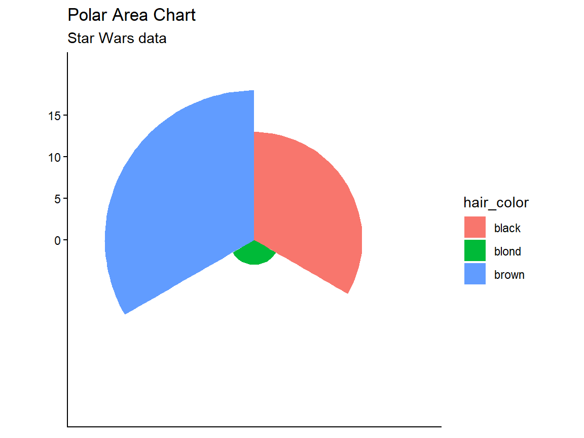
Spatial Axis Orientation
Polar Area Charts
- Pie charts require angle and area judgements.
- Polar area charts are a more direct equivalent of bar charts.